银行案例学习实例1_风险管理数据可视化
banking case1
up主微信公众号pythonEducation

A Scientist & An Artist
几个星期前,在文艺复兴的发源地佛罗伦萨四处闲逛时,我无法逃脱达芬奇的思想:有史以来最伟大的博学者。 莱昂纳多的杰出作品包括画家,发明家,物理学家,天文学家,工程师,生物学家,解剖学家,地质学家和建筑师等称号 - 不开玩笑! 一只聪明的猫将不得不过她九年的生命来获得莱昂纳多一生中掌握的九个冠军头衔。 今天,在讨论数据可视化的各个方面时,我们应该向莱昂纳多叔叔致敬,因为我们跨越了艺术和科学的领域。
A few weeks ago while wandering around in Florence, the birthplace of the Renaissance, I could not escape the thought of Leonardo da Vinci : the greatest polymath of all times. Leonardo’s illustrious resume contains titles such as painter, inventor, physicist, astronomer, engineer, biologist, anatomist, geologist, and architect – no kidding! A smart cat would have to live all her nine lives to acquire the nine titles Leonardo had mastered in one lifetime. Today, while discussing facets of data visualization, we should pay homage to Uncle Leonardo as we cross the realm of both art and science.
Art and Science of Data Visualization
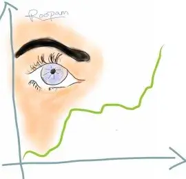
Data Visualization – by Roopam
如前所述,数据可视化既是艺术又是科学。 我个人更喜欢长时间查看数据,在进入严格的数学建模之前以各种方式绘制数据。 你可能已经注意到我对艺术的偏爱,同时浏览了我在博客上所有帖子中展示的艺术作品。 这句话 - 一张图片胜过千言万语 - 在数据分析过程中也是如此。 如果您没有在数据探索阶段花费足够的时间,那么分析中的模型可能会出现严重错误 - 这些都是关于数据可视化的。 让我提出一个案例研究示例来解释探索阶段数据可视化的各个方面。
Data visualization, as mentioned earlier, is both art and science. I personally prefer to have a long look at the data, plotting them in various ways before jumping into rigorous mathematical modeling. You might have noticed my penchant for art while going through my artwork presented in all the posts on this blog. The saying – a picture is worth thousand words – holds true during data analysis as well. Models in analytics can go horribly wrong if you have not spent enough time on the data exploratory phase – which is all about data visualization to me. Let me present a case study example to explain the aspects of data visualization during the exploratory phase.
Banking Case Study Example – Risk Management
假设您是CyndiCat银行的首席风险官(CRO),该银行在2012年4月至6月期间在该季度发放了60816个汽车贷款。今天,自贷款发放以来大约一年零四个季度,您知道贷款已经过时或者糟糕 贷款被标记为更加确定(阅读详细讨论)。 你注意到在60816笔已发放贷款中,不良贷款率约为2.5%或1524。
在您跳转到多变量分析和信用评分(阅读有关信用评分的详细讨论)之前,您需要分析几个单独变量的不良率。 根据您的经验,您有预感,借款人在贷款发放时的年龄是不良利率的关键区别因素。 因此,您根据借款人的年龄对贷款进行了划分,并创建了一个类似下面的表格。
Assume you are the chief risk officer (CRO) for CyndiCat bank that has disbursed支付 60816 auto loans in the quarter between April–June 2012. Today, about a year and a quarter since the loans disbursal, you know that the loans have seasoned or bad loans are tagged to a greater certainty (read a detailed discussion). You have noticed a bad rate of around 2.5% or 1524 bad loans out of total 60816 disbursed loans.
Before you jump to multivariate analysis and credit scoring (read a detailed discussion on credit scoring), you want to analyze the bad rate across several individual variables. You have a hunch based on your experience that borrower’s age at the time of loan disbursal is a key distinguishing factor for bad rates. Therefore, you have divided the loans based on the age of the borrowers and created a table something like the one below.
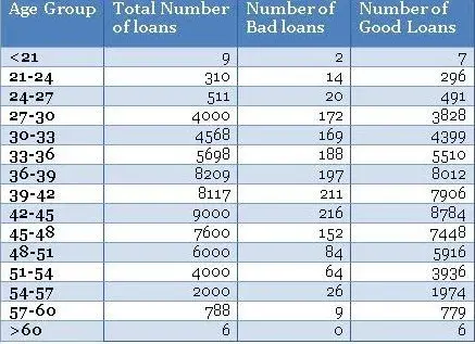
Using the above table, you have created a histogram and zoomed into the area of interest (close to the bad loans) as shown in the plots below.
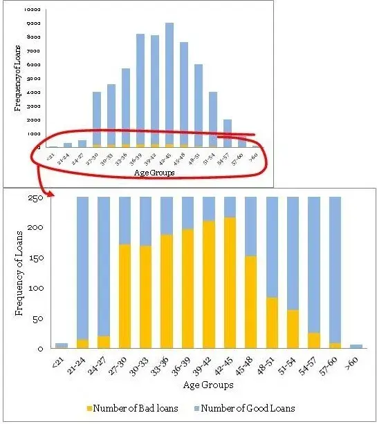
不同年龄组的贷款分配是一个相当平滑的正态分布曲线,没有太多的异常值。年龄经常为大多数产品展示这种模式。但是,不要指望业务场景中其他常见变量的类似平滑曲线。通常,您可能必须解决变量转换以使分布平滑。
•最大不良贷款年龄为42至45岁。这当然并不意味着风险也是最高的,但是,一旦我听到有人在季度业务审查会议上得出类似的结论 - 这是一个愚蠢的错误。注意,最高贷款也在42至45年。绝对数字不能提供足够的信息,因此我们需要创建一个标准化的图。
•条纹桶(即<21和> 60年组)的数据非常薄,只有9个和6个数据点 - 处理这些薄数据时要小心。在模型开发时,修改这些边缘桶的良好业务知识非常有用。例如,您知道对于年龄在60岁以上的贷款可能存在高风险,但在这些数据中,我们没有足够的证据证明这一点,因为我们没有足够的数据来验证我们的假设。在这种情况下,我们应该补充正确的风险权重 - 但是,这样做时要非常小心。
You must have noticed the following
• The distribution of loans across age groups is a reasonably smooth normally distributed curve, without too many outliers. Age often display this kind of pattern for most products. However, do not expect similar smooth curves for other commonly found variables in a business scenario. Often, you may have to resolve to variable transformation to make the distributions smooth.
• The maximum bad loans are in the age bucket 42 to 45 years. This certainly does not mean the risk is also the highest in this bucket, however, once I have heard someone drawing a similar conclusion in a quarterly business review meeting –a silly mistake. Note, the maximum loans are also in the bucket 42 to 45 years. Absolute numbers do not provide enough information hence we need to create a normalized plot.
• The data is really thin on the fringe buckets (i.e. <21 and >60 years groups) with only 9 and 6 data points – be careful when dealing with such thin data. Sound business knowledge to modify these fringe buckets is extremely helpful while a model development. For instance, you know that for age above 60 for loans could be highly risky, but in this data, we do not have enough evidence for the same since we do not have enough data to validate our hypothesis. We should supplement a right risk weight in such situation – however, be very careful while doing so.
Normalized Plot
The normalized plot is easy to construct. The idea is to scale each age group to 100% and overlay bad and good percentage of records on top. We could extend the table shown above to get the values for the normalized plot as shown below.
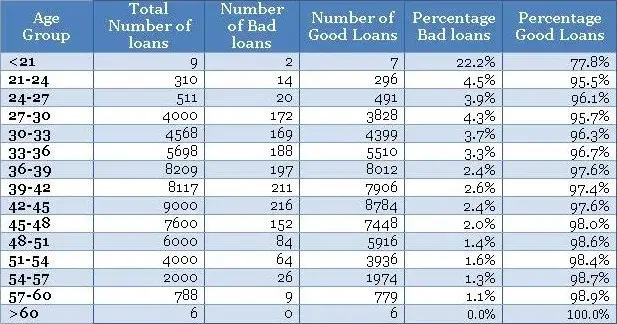
Now, once you have the table ready you could create a normalized plot quite easily, as shown below (again we have zoomed into the plot to get a clear view of bad rates).
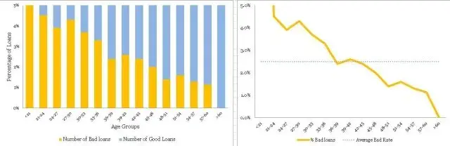
在不良率和年龄组方面存在明显的趋势。 随着借款人变老,他们不太可能拖欠贷款。 这是一个很好的见解。
•同样,条纹(即<21和> 60年组)具有薄数据,不能从标准化图获得该信息。 因此,您需要使用频率图来方便地处理不同的瘦数据。 一个方便的经验法则是在认真对待信息之前至少有10个(好的和坏的)病例的记录 - 否则,它没有统计学意义。
These plots are completely different from the original frequency count plot and presenting the information in a completely different light. The following are the things one could conclude from the plots.
• There is a definite trend in terms of the bad rates and the age groups. As the borrowers are getting older, they are less likely to default on their loans. That is a good insight.
• Again, the fringes (i.e. <21 and >60 years groups) have thin data, this information cannot be obtained from the normalized plot. Hence, you need to have the frequency plot handy to treat thin data differently. A handy rule of thumb is to have at least 10 records of both (good & bad) cases before taking the information seriously – otherwise, it is not statistically significant.
I must conclude by saying that, data visualization is the beginning of modeling process and not the destination. However, it is a good & creative beginning.
Sign-off Note
我必须总结说,数据可视化是建模过程的开始,而不是目的地。 然而,这是一个良好的创造性开端。
签字笔记
凭借大数据,数据分析工具和技术,科学进步和民主环境 - 我们可以生活在我们这个时代的文艺复兴时期。 但是,我们需要更多的达芬奇才能让这些时间变得非常特别。
With big data, data analysis tools & technologies, scientific progress and democratic environment – we could be living in the Renaissance of our times. However, we will need more Leonardo da Vincis to make these times really special.
博主网校主页http://dwz.date/bwes