CSS3.0知识和例子大合集:盒子模型,图片边框,蝙蝠边框,加载动画【诗书画唱】
CSS3.0非常适合前端的界面的设计。下面的例子基本是使用嵌入式的CSS。
下面是知识点和例子的超级大的合集。
本期内容:
图片边框(比如蝙蝠边框)
多张图片叠加的广告效果界面
CSS3加载动画
CSS3闪耀的星星的动态效果
CSS3心型
CSS3跳动的心型
CSS3多媒体查询实例
CSS样式类型
写在style标签中的样式就叫嵌入式样式
写在元素的style属性中的样式就叫内联式样式
通用选择器
子选择器:>表示选择ul标签的儿子中间的a标签
空格表示选择ul标签所有的后代中的a标签
群组选择器
学习笔记讲义
CSS选择器
CSS伪类选择器
CSS伪元素选择器
CSS权重
CSS样式继承
CSS元素的分类
CSS边框
CSS浮动模型
CSS层模型
CSS定位布局例子
CSS清除浮动
盒子模型
样式中的长度单位
rem的使用
CSS3新的属性
CSS3boxsizing属性
CSS3线性渐变
学习笔记讲义
CSS3-1新的属性.ppt
CSS3-2字体.ppt
CSS3-3转换和过渡.ppt
CSS3-4动画.ppt
CSS3-5媒体查询.ppt
CSS3-6弹性盒子.ppt
CSS3-7栅格系统.ppt
作业
通过CSS绘制一个三角形
通过CSS代码居中显示div


推荐教程:https://www.runoob.com/css3/css3-3dtransforms.html

CSS3加载动画 START

<!DOCTYPE html>
<html>
<head>
<meta charset="UTF-8">
<title></title>
<style type="text/css">
* {/* 将所有标签的边距和填充都设为0 */
margin: 0;
padding: 0;
box-sizing: border-box;
}
html, body {
width: 100%;
height: 100%;
}
body {
background: #0b0b14;
font-family: 'Inconsolata', monospace/*等宽字体*/;
overflow: hidden;/*清除浮动*/
}
@keyframes rt {
100% {
transform: rotate(360deg);/*旋转*/
}
}
@keyframes cw {
0% {
width: 0;
height: 0;
}
75% {
width: 40px;
height: 40px;
}
100% {
width: 0;
height: 0;
}
}
@keyframes txt {
0% {
content: "LOADING.";
}
50% {
content: "LOADING..";
}
100% {
content: "LOADING...";
}
}
.arc {
position: absolute;
margin: auto;
top: 0;
right: 0;
bottom: 0;
left: 0;
width: 100px;
height: 100px;
border-radius: 50%;
border-top: 2px solid #ffea29;
border-left: 1px solid transparent;/*transparent表示全透明黑色*/
border-right: 1px solid transparent;
/*infinite表示无限次重复,linear表示线性*/
animation: rt 2s infinite linear;
}
.arc::before {
position: absolute;
margin: auto;
top: 0;
right: 0;
bottom: 0;
left: 0;
width: 70px;
height: 70px;
border-radius: 50%;
border-top: 2px solid #8d29ff;
border-left: 1px solid transparent;/*transparent表示全透明黑色r*/
border-right: 1px solid transparent;
/*infinite表示无限次重复,linear表示线性,reverse表示一直向后运动*/
animation: rt 4s infinite linear reverse;
content: "";
}
.arc::after {
position: absolute;
margin: auto;
top: 0;
right: 0;
bottom: 0;
left: 0;
width: 0;
height: 0;
border-radius: 50%;
border-top: initial;/*默认的属性*/
border-left: initial;
border-right: initial;
animation: cw 1s infinite;
content: "";
background: snow;
}
h1 {
position: absolute;
height: 40px;
margin: auto;
top: 200px;
left: 0;
right: 0;
bottom: 0;
text-transform: uppercase;/*将文本的英文字母改为大写*/
text-align: center;
letter-spacing: 0.1em;/*字体间距,相当于十分之一的字体大小*/
font-size: 14px;
font-weight: lighter;/*字体为细体*/
color: white;
}
h1 span {
display: none;
}
h1::after {
animation: txt 5s infinite;
content: "";
}
</style>
</head>
<body>
<div class="arc"></div>
<h1><span></span></h1>
</body>
</html>

CSS3加载动画 END
CSS3跳动的心型 START

<!DOCTYPE html>
<html>
<head>
<meta charset="UTF-8">
<title></title>
<style type="text/css">
body{
width: 100%;
text-align: center;
}
.ax{
position: relative;
width: 300px;
height: 300px;
margin: 200px auto;
background-color: chartreuse;
transform: rotate(45deg);
animation: name 2s infinite;
}
.ax div{
position: absolute;
width: 200px;
height: 200px;
background-color: red;
}
.left{
left: 0;
bottom: 0;
background-color: blue;
border-radius:50%;
}
.right{
top: 0;
right: 0;
/*background-color: yellow;*/
border-radius:50%;
}
.cen{
right: 0;
bottom:0;
/*background-color: #FF8C00;*/
}
@keyframes name{
10%{
transform: scale(1.1) rotate(45deg);
}
20%{
transform: scale(1.2)rotate(45deg);
}
30%{
transform: scale(1.3)rotate(45deg);
}
40%{
transform: scale(1.4)rotate(45deg);
}
50%{
transform: scale(1.3)rotate(45deg);
}
60%{
transform: scale(1.2)rotate(45deg);
}
70%{
transform: scale(1.3)rotate(45deg);
}
80%{
transform: scale(1.4)rotate(45deg);
}
90%{
transform: scale(1.2)rotate(45deg);
}
}
</style>
</head>
<body>
<div class="ax">
<div class="left"></div>
<div class="cen"></div>
<div class="right"></div>
</div>
</body>
</html>

CSS3跳动的心型 END
CSS3闪耀的星星的动态效果 START


<!DOCTYPE html>
<html>
<head>
<meta charset="UTF-8">
<title></title>
<style type="text/css">
body {
/*设置背景颜色为黑色*/
background-color: #000;
}
span {
/*span是行内元素,本来不可以设置宽和高。但添加绝对定位就变成BFC元素,就可以设置宽和高*/
position: absolute;
width: 30px;
height: 30px;
background: url("51.png");
background-size: 100% 100%;
}
span:hover {
/*scale(3,3)表示宽度和高度都放大三倍(2D缩放转换),并旋转180度*/
transform: scale(3,3) rotate(180deg) !important;
transition: all 1s;
}
</style>
<script>
window.onload = function() {
//获取当前界面的大小,界面变小或变小星星的位置和数量不会改变
var screenW = document.documentElement.clientWidth;
var screenH = document.documentElement.clientHeight;
//动态创建多个星星
for(var i = 0;i < 150;i ++) {
var span = document.createElement('span');
//将动态创建的span元素添加到body里面
document.body.appendChild(span);
//随机函数产生0-1之间的数,左闭右开,定位星星的位置
var x = parseInt(Math.random() * screenW);
var y = parseInt(Math.random() * screenH);
span.style.left = x + 'px';
span.style.top = y + 'px';
//图片大小随机
var scale = Math.random() * 1.5;
//定义2D缩放转换
span.style.transform =
'scale(' + scale + ',' + scale + ')';
}
}
</script>
</head>
<body>
</body>
</html>

CSS3闪耀的星星的动态效果 END
CSS3心型 START

<!DOCTYPE html>
<html>
<head>
<meta charset="UTF-8">
<title></title>
<style type="text/css">
body{
width: 100%;
text-align: center;
}
.ax{
position: relative;
width: 300px;
height: 300px;
margin: 200px auto;
background-color: chartreuse;
transform: rotate(45deg);
}
.ax div{
position: absolute;
width: 200px;
height: 200px;
background-color: red;
}
.left{
left: 0;
bottom: 0;
background-color: blue;
border-radius:50%;
}
.right{
top: 0;
right: 0;
/*background-color: yellow;*/
border-radius:50%;
}
.cen{
right: 0;
bottom:0;
/*background-color: #FF8C00;*/
}
</style>
</head>
<body>
<div class="ax">
<div class="left"></div>
<div class="cen"></div>
<div class="right"></div>
</div>
</body>
</html>

CSS3心型 END
CSS3多媒体查询实例 START

<!DOCTYPE html>
<html>
<head>
<meta charset="UTF-8">
<title></title>
<style>
ul {
list-style-type: none;
}
ul li a {
color:green;
text-decoration: none;
padding: 3px;
display: block;
}
@media screen and (max-width: 699px) and (min-width: 520px), (min-width:1151px){
ul li a {
padding-left: 30px;
background: url(img/emoticon2.ico) left center no-repeat;
}
}
@media screen and (max-width: 1000px) and (min-width: 700px) {
ul li a:before {
content: "地址: ";
font-style: italic;
color: #666666;
}
}
@media screen and (min-width: 1001px) {
ul lia:after {
content: " ("attr(data-ctx)")";
font-size: 12px;
font-style: italic;
color: #666666;
}
}
</style>
</head>
<body>
<ul>
<li><a href="#" data-ctx="说明1">链接1</a></li>
<li><a href="#" data-ctx="说明1">链接2</a></li>
<li><a href="#" data-ctx="说明1">链接3</a></li>
</ul>
</body>
</html>

CSS3多媒体查询实例 END
CSS样式类型 START

<!DOCTYPE html>
<html>
<head>
<meta charset="UTF-8">
<title></title>
<!-- 写在style标签中的样式就叫嵌入式样式 -->
<style type="text/css">
p {
font-size: 30px;
color: blue;
}
</style>
<link rel="stylesheet" href="css/my.css" />
</head>
<body>
<!-- 写在元素的style属性中的样式就叫内联式样式 -->
<div style="width: 100px;height: 100px;background-color: red;"></div>
<p>Hello world</p>
<span>测试文字</span>
</body>
</html>

CSS样式类型 END
CSS选择器 START

<!DOCTYPE html>
<html>
<head>
<meta charset="UTF-8">
<title></title>
<style type="text/css">
#ctx {
color: red;
}
.bg {
}
span {
color: orange;
}
/*通用选择器*/
*{}
/*子选择器:>表示选择ul标签的儿子中间的a标签
空格表示选择ul标签所有的后代中的a标签*/
ul>a {
color: red;
}
/*群组选择器:,*/
div,input {
background-color: yellow;
}
#ctx,span {
font-size: 50px;
}
</style>
</head>
<body>
<ul>
<a href="#">扩展</a>
<li>语文</li>
<li>数学<a href="#">浏览</a></li>
<li>英语<div><h1><a href="#">PPP</a></h1></div></li>
</ul>
<div id="ctx">aaa</div>
<span class="bg">hehe</span>
<span class="bg">bbb</span>
<span class="bg">cccc</span>
<input type="text" class="bg" />
<span>lop</span>
</body>
</html>

CSS选择器 END
CSS伪类选择器 START

<!DOCTYPE html>
<html>
<head>
<meta charset="UTF-8">
<title></title>
<style type="text/css">
#inp:active {
border: 5px red solid;
}
#inp:focus {
font-size: 50px;
}
div:hover {
color: orange;
}
a:link {
color: deeppink;
text-decoration: line-through;
}
a:visited {
color: green;
}
li:first-child {
color: red;
}
</style>
</head>
<body>
<ul>
<li>HTML</li>
<li>CSS</li>
<li>JS</li>
</ul>
<ul>
<li>语文</li>
<li>数学</li>
<li>英语</li>
</ul>
<input id="inp" type="text" />
<div>Hello world</div>
<a href="#">浏览</a>
</body>
</html>

CSS伪类选择器 END
CSS伪元素选择器 START

<!DOCTYPE html>
<html>
<head>
<meta charset="UTF-8">
<title></title>
<style type="text/css">
p::first-letter {
font-size: 50px;
}
#myDiv::first-line {
color: red;
}
#link {
position: relative;
display: inline-block;
outline: none;
text-decoration: none;
color: #000;
font-size: 12px;
padding: 5px 10px;
left: 100px;
}
#link:hover::before,a:hover::after {
position: absolute;
}
#link:hover::before {
content: '\5B';
left: -20px;
}
#link:hover::after {
content: '\5D';
right: -20px;
}
#sc {
position: absolute;
left: 200px;
top: 400px;
}
#sc:hover::before {
content: url(img/wingLeft.jpg);
position: absolute;
left: -80px;
top: -80px;
opacity: 0.5;
}
#sc:hover::after {
content: url(img/wingRight.jpg);
position: absolute;
right:-80px;
top:-80px;
opacity: 0.5;
}
</style>
</head>
<body>
<a href="#" id="sc">
<img src="img/23.png" />
</a>
<br>
<a id="link" href="#">haoroom</a>
<p>
举头望明月,低头思故乡
</p>
<p>
两岸猿声啼不住,轻舟已过万重山
</p>
<div id="myDiv">
aaaaaaaaaaaa
<br>
bbbbbbbbbbbb
<br>
cccccccccccc
</div>
</body>
</html>

CSS伪元素选择器 END
CSS权重 START
<!DOCTYPE html>
<html>
<head>
<meta charset="UTF-8">
<title></title>
<style type="text/css">
*{
color: red;/*0,0,0,0*/
}
div {
color: yellow;/*0,0,0,1*/
}
div span {
color: green;/*0,0,0,2*/
}
span[id] {
color:orange;/*0,0,1,1*/
}
#sp1 {
color: pink;/*0,1,0,0*/
}
</style>
</head>
<body>
<!-- 1,0,0,0 -->
<div style="color: orange;">Hello world</div>
<div>Hello
<span>A</span>
<span id="sp1">G</span>
<span>K</span>
</div>
</body>
</html>

CSS权重 END
CSS样式继承 START

<!DOCTYPE html>
<html>
<head>
<meta charset="UTF-8">
<title></title>
<style type="text/css">
*{
color:yellow;
}
.list .item {/*0,0,2,0*/
color: red;
font-size: 50px;
border: 5px solid green;
}
</style>
</head>
<body>
<ul class="list">
<li class="item">AAA
<!-- span元素没有color属性,按道理应该就是显示黑色,
但是因为它的父元素li的color属性是红色,
所以这个样式属性被继承给了它的子元素span
-->
<span>注意文字的颜色</span>
</li>
<li>
BBB
</li>
</ul>
</body>
</html>

CSS样式继承 END
CSS元素的分类 START
<!DOCTYPE html>
<html>
<head>
<meta charset="UTF-8">
<title></title>
<style type="text/css">
div {
height: 100px;
background-color: gray;
}
</style>
</head>
<body>
<a href="#">KKK</a>
<a href="#">JJJ</a>
<a href="#">HHH</a>
<span style="width: 1500px;">Hello world</span>
<div>A</div><div>B</div>
<div style="width: 200px;">
<div>C</div>
</div>
<input type="text" style="width: 200px;height: 60px;"/>
<input type="text"/>
<input type="text"/>
</body>
</html>

CSS元素的分类 END
CSS边框 START
<!DOCTYPE html>
<html>
<head>
<meta charset="UTF-8">
<title></title>
<style type="text/css">
#ctx {
width: 200px;
height: 200px;
border: 10px solid red;
border-radius: 100%;
}
</style>
</head>
<body>
<div id="ctx">AAA</div>
</body>
</html>

CSS边框 END
CSS浮动模型 START
<!DOCTYPE html>
<html>
<head>
<meta charset="UTF-8">
<title></title>
<style type="text/css">
div {
width: 100px;
height: 100px;
float: right;
}
</style>
</head>
<body>
<div style="background-color: red;">A</div>
<div style="background-color: green;">B</div>
</body>
</html>

CSS浮动模型 END
CSS层模型 START
<!DOCTYPE html>
<html>
<head>
<meta charset="UTF-8">
<title></title>
<style type="text/css">
#d1 {
width: 200px;
height: 200px;
border: 5px solid red;
position: relative;
top: 2300px;
left: 300px;
}
#d2 {
width: 200px;
height: 200px;
border: 5px solid blue;
}
#d3 {
width: 200px;
height: 200px;
border: 5px solid green;
position: fixed;
top: 100px;
right: 10px;
}
</style>
</head>
<body>
<div id="d1"></div>
<div id="d2"></div>
<div id="d3">广告位</div>
</body>
</html>

CSS层模型 END
CSS定位布局例子 START
<!DOCTYPE html>
<html>
<head>
<meta charset="UTF-8">
<title></title>
<style type="text/css">
#box1 {
width: 400px;
height: 400px;
background-color: pink;
position: relative;
left: 100px;
top: 150px;
}
#box2 {
width: 100px;
height: 100px;
background-color: red;
position: absolute;
left: 50px;
top: 100px;
}
</style>
</head>
<body>
<div id="box1">
<div id="box2">AAA</div>
</div>
</body>
</html>

CSS定位布局例子 END
CSS清除浮动 START
<!DOCTYPE html>
<html>
<head>
<meta charset="UTF-8">
<title></title>
<style type="text/css">
/*清除浮动方法三:给父元素添加一个伪元素*/
#dv::after {
display: block;
clear: both;
content: '';
visibility: hidden;
height: 0;
}
</style>
</head>
<body>
<!-- 清除浮动方法二:在父元素样式中添加overflow: hidden; -->
<div id="dv" style="background-color: blue;">
<div style="float: left;">A</div>
<div style="float: left;">B</div>
<div style="float: left;">C</div>
<!-- 清除浮动的方法一 -->
<!--<div style="width: 0;height: 0;clear: both;"></div>-->
</div>
</body>
</html>

CSS清除浮动 END
盒子模型 START
<!DOCTYPE html>
<html>
<head>
<meta charset="UTF-8">
<title></title>
<style type="text/css">
#a {
background-color: red;
height: 100px;
}
#c {
background-color: blue;
height: 100px;
}
#b {
background-color: yellow;
width: 100px;
height: 100px;
margin: -50px 0px;
border: 5px red solid;
padding: 20px;
}
</style>
</head>
<body>
<div id="a"></div>
<div id="b"></div>
<div id="c"></div>
<br>
<input type="text" />
<span style="margin-left: -170px;">搜索</span>
</body>
</html>

盒子模型 END
样式中的长度单位 START
<!DOCTYPE html>
<html>
<head>
<meta charset="UTF-8">
<title></title>
<style type="text/css">
body {
font-size: 100px;
}
div {
/*字体大小是: 100 * 0.3 = 30px */
font-size: 0.3em;
/*宽度是当前元素的字体大小的6倍: 30 * 6 = 180px */
width: 6em;
height: 6em;
background-color: red;
}
#ctx {
font-size: 50px;
}
p {
font-size: 0.8em;
width: 3em;
}
</style>
</head>
<body>
<div>Hello world</div>
<div id="ctx">
<p>AAA</p>
</div>
</body>
</html>

样式中的长度单位 END
rem的使用 START
<!DOCTYPE html>
<html>
<head>
<meta charset="UTF-8">
<title></title>
<style type="text/css">
html {
font-size: 200px;
}
.cls {
width: 5rem;
height: 4rem;
background-color: pink;
position: absolute;
top: 50%;
left: 50%;
margin-left: -2.5rem;
margin-top: -2rem;
padding: 0px;
}
</style>
</head>
<body>
<div class="cls"></div>
</body>
</html>

rem的使用 END
CSS3新的属性 START
<!DOCTYPE html>
<html>
<head>
<meta charset="UTF-8">
<title></title>
<style type="text/css">
#a {
border: 2px solid red;
width: 200px;
height: 200px;
border-radius: 50%;
box-shadow: 10px 10px 5px #808080;
}
#b {
border: 15px solid transparent;
width: 100px;
height: 100px;
border-image: url(img/Bat.png) 30 30 stretch;
}
#c {
width: 400px;
height: 400px;
background-image: url(img/shot.png),url(img/bg1.jpg);
background-position: left bottom,left top;
background-repeat: no-repeat,no-repeat;
}
#d {
border: 100px solid white;
background-color: pink;
padding: 100px;
background-image: url(img/23.png);
background-repeat: no-repeat;
background-position: left;
background-origin: padding-box;
}
</style>
</head>
<body>
<div id="d">Hello world</div>
<div id="c"></div>
<div id="a"></div>
<div id="b"></div>
</body>
</html>
/* 图片边框*/
多张图片叠加的广告效果界面:

CSS3新的属性 END
CSS3boxsizing属性 START
<!DOCTYPE html>
<html>
<head>
<meta charset="UTF-8">
<title></title>
<style type="text/css">
.box {
width: 300px;
height: 300px;
background-color: yellow;
}
.first {
width: 150px;
height: 100px;
float: left;
background-color: pink;
border: 5px red solid;
box-sizing: border-box;
}
.second {
width: 150px;
height: 100px;
background-color: blue;
float: left;
}
</style>
</head>
<body>
<div class="box">
<div class="first"></div>
<div class="second"></div>
</div>
</body>
</html>

CSS3boxsizing属性 END
CSS3线性渐变 START
<!DOCTYPE html>
<html>
<head>
<meta charset="UTF-8">
<title></title>
<style type="text/css">
#a {
height: 400px;
/*top,bottom,left,right*/
background-image: linear-gradient(to top left,red,blue);
}
#b {
height: 400px;
background-image: linear-gradient(red,orange,yellow,green,blue,indigo,violet);
}
</style>
</head>
<body>
<div id="b"></div>
<div id="a"></div>
</body>
</html>

CSS3线性渐变 END
学习笔记讲义 START

盒子模型:
content:内容
padding:填充,控制内容和边框之间的空白的
border:边框
margin:外边距
position:位置
长度单位:px,em,rem
px:像素
em:比例缩放,子元素的样式根据父元素的字体大小进行设置
rem:root em,根据根标签<html>的字体大小来进行计算
学习笔记讲义 END
CSS3-1新的属性.ppt START


CSS3-1新的属性.ppt END
CSS3-2字体.ppt START


linear:规定以相同速度开始至结束的过渡效果
ease:规定慢速开始,然后变快,然后慢速结束的过渡效果
ease-in:规定以慢速开始的过渡效果
ease-out:规定以慢速结束的过渡效果
ease-in-out:规定以慢速开始和结束的过渡效果
CSS3-3转换和过渡.ppt END
CSS3-4动画.ppt START


CSS3-4动画.ppt END
CSS3-5媒体查询.ppt START


CSS3-5媒体查询.ppt END
CSS3-6弹性盒子.ppt START


align-content属性用于修改flex-wrap属性的行为。类似于align-items, 但它不是设置弹性子元素的对齐,而是设置各个行的对齐。
1、stretch:默认,各行将会伸展以占用剩余的空间。
2、flex-start:各行向弹性容器的起始位置堆叠。
3、flex-end:各行向弹性容器的结束位置堆叠。
4、center:各行向弹性盒容器的中间位置堆叠。
5、space-between:各行在弹性盒容器中平均分布。
6、space-around:各行在弹性盒容器中平均分布,两端保留子元素与子元素之间间距大小的一半。
注意:必须对父元素设置自由盒属性display:flex;,并且设置排列方式为横向排列flex-direction:row;并且设置换行,flex-wrap:wrap;这样这个属性的设置才会起作用。


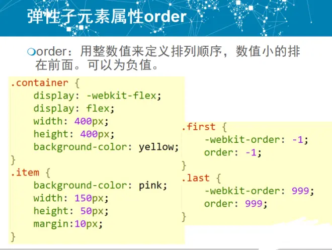


flex属性用于指定弹性子元素如何分配空间。
auto: 计算值为 1 1 auto
initial: 计算值为 0 1 auto
none:计算值为 0 0 auto
inherit:从父元素继承
[ flex-grow ]:定义弹性盒子元素的扩展比率。
[ flex-shrink ]:定义弹性盒子元素的收缩比率。
[ flex-basis ]:定义弹性盒子元素的默认基准值

CSS3-6弹性盒子.ppt END
CSS3-7栅格系统.ppt START


CSS3-7栅格系统.ppt END
作业 START
1、通过CSS绘制一个三角形
<!DOCTYPE html>
<html>
<head>
<meta charset="UTF-8">
<title></title>
</head>
<style>
#dengBianSanJiaoXing{
width: 0;
height: 0;
border-left: 50px solid transparent;
border-right: 50px solid transparent;
border-bottom: 100px solid red;
}
</style>
<body>
<div id="dengBianSanJiaoXing">
</div>
</body>
</html>


更多扩展例子:https://www.jb51.net/article/42513.htm
transparent属性用来bai指定全透明色彩
transparent是全透明黑色(black)的速记法,即一个类似rgba(0,0,0,0)这样的值。在CSS1中,transparent被用来作为background-color的一个参数值,用于表示背景透明。
transparent透明的。
2、通过CSS代码居中显示div
<!DOCTYPE html>
<html>
<head>
<meta charset="UTF-8">
<title></title>
</head>
<style>
#seKuai{
width: 66px;
height: 66px;
background-color: red;
position: absolute;
top: 0;
left: 0;
bottom: 0;
right: 0;
margin: auto;
}
</style>
<body>
<div id="seKuai">
</div>
</body>
</html>
absolute:绝对定位

推荐:https://blog.csdn.net/a1044187112/article/details/108261893
